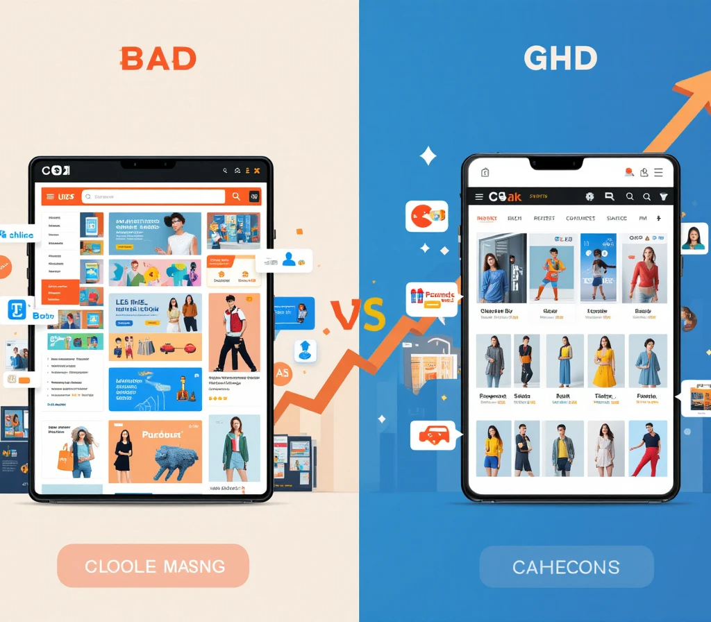
E-commerce Design Mistakes to Avoid for a Successful Online Store
Creating a thriving online store requires more than just stocking products. Your e-commerce website design plays a pivotal role in converting visitors into customers. However, many businesses fall into common traps that can deter potential customers. In this article, we’ll explore crucial e-commerce design mistakes you should avoid to enhance user experience and boost sales.
Ignoring Mobile Optimization
With mobile shopping on the rise, not having a mobile-responsive design can significantly hurt your business. Ensure your store’s layout adjusts seamlessly to different screen sizes, providing a smooth shopping experience on tablets and smartphones. Prioritize mobile-friendly navigation, fast loading times, and accessible touch elements.
Complicated Navigation
Visitors need to find products easily and quickly. Complicated navigation can irritate users and increase bounce rates. Keep your menu simple and logically structured. Use clear categories and subcategories, and always include a search bar to help users find what they need without hassle.
Poor Search Functionality
Invest in a robust search tool that provides accurate and relevant results. Faceted search options can help users narrow down their choices based on different criteria, improving their shopping experience.
Neglecting Loading Speed
Loading speed affects your site’s performance and user satisfaction. Slow websites lose customers. Reduce image sizes, optimize code, and leverage browser caching to improve load times. Regularly test your site’s speed using tools like Google PageSpeed Insights.
Unclear Call-to-Action (CTA)
Make sure your CTAs stand out. They guide users toward taking the desired action, like adding a product to the cart or signing up for a newsletter. Use contrasting colors and actionable text to catch customer attention. Position CTAs strategically across your website.
Avoid Generic CTAs
Customize your CTAs to reflect the action you want users to take. Instead of a generic “Click Here,” use specific instructions like “Shop Now” or “Get 20% Off.”
Overloading with Text
Visitors scan rather than read online content. Long paragraphs can overwhelm users. Use bullet points, concise copy, and descriptive headings to keep the content digestible. Highlight key information, and make sure your product descriptions are clear and to the point.
Ignoring Visual Appeal
First impressions matter. An attractive design can engage users right away. Use high-quality images and consistent branding elements to create a visually appealing online store. Regularly update visuals to reflect seasonal promotions or new product launches.
Inadequate Product Details
Detail is crucial in online shopping. Provide comprehensive product descriptions, specifications, and customer reviews to help customers make informed decisions. Use multiple images from different angles, and consider incorporating videos to showcase products in use.
Lack of Customer Reviews
Shoppers rely heavily on reviews. Encourage customers to leave feedback and display these reviews prominently on product pages. Positive reviews build trust and can significantly influence purchasing decisions.
Failing to Highlight Security
Online shoppers are concerned about security. Display trust badges, secure payment options, and clear privacy policies to reassure customers their data is safe. Highlight these elements on your checkout page to encourage transaction completion.
Conclusion
Avoiding these common e-commerce design mistakes can significantly enhance user experience and increase conversion rates. By ensuring your site is mobile-friendly, fast, and visually appealing, while providing high-quality content and clear navigation, you can create a compelling shopping journey for your customers.
For more exceptional tips on improving your online store design, visit our website.
“`


